Design trends can be a controversial topic. Everyone has different tastes, definitions, and preconceptions about what constitutes a trend. Some believe that if a style is considered trendy, it won’t stand the test of time. Does that mean what’s trendy now will be out of style in a few years? Not necessarily.
In our previous trends reports, we took a backward look at industry trends. This report is a little different. By reading articles, talking to reps, and going to industry shows, we’re going out on a limb and forecasting what will be trending in 2023 and beyond.
Design trends are cyclical! I’m seeing a resurgence of styles from the 70s, 80s, and even Y2K. It’s not uncommon to see styles from the past 20-50 years come back in vogue.
What surprised me is the interest and revival of styles from the 1920s and 1930s. Yes, the golden age is back, and I couldn’t be more thrilled. Stencils, murals, and gilding are making their way back into furniture, textiles, and surface treatments with refreshed color palettes and designs.
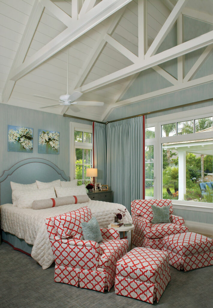
The English cottage is making a comeback, taking on a distinct 30s vibe with an eclectic mix of antique treasures, upcycling, auctions, and even thrifting. We’re playing with scale incorporating oversized lighting and decor. Be forewarned, in the wrong hands this approach can look haphazard and clumsy. With thought, planning, and the right design team, clients can have a style that is unique to them. And who doesn’t want a look that is truly you?
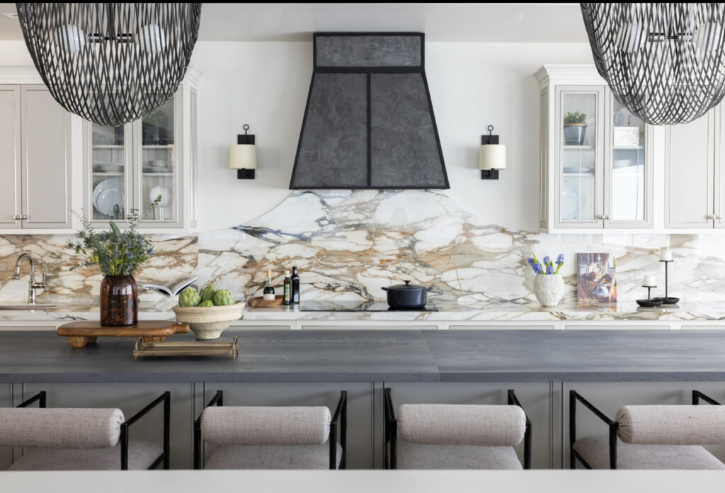
Super shiny finishes have been popular (and still are) but we are seeing a slight shift of the application. Thoughtful moves with sheen in precise places mixed with organic finishes throughout add a sophisticated look without appearing overly complicated and fussy.
Fast furniture is out. With rising prices and lead times, it’s tempting to source from big box and online retailers. Avoid this temptation! What you gain in cost savings and expediency is overshadowed by cheap materials and fabrication that doesn’t hold up over time. Mass-market retailers don’t set trends, they follow them. Invest your money wisely in furnishings that maintain their value.
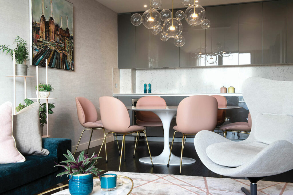
Some of our clients are enjoying the fusion of Asian and Scandinavian styling in their design schemes. And there is a name for it you may have heard: Japandi. According to Leni Calas of Ward 5 Design, “Japandi design is the combination of Scandinavian functionality and Japanese rustic minimalism to create a feeling of art, nature, and simplicity.” This fusion creates the perfect blend of function and form, focusing on clean lines, bright spaces, and light colors. We believe the influence and renewed experience of travel is affecting personal styles in a new way.
The design trend of wide open floorplan concepts are on the wane, with the exception of young families who still prefer an open kitchen and living space. Defined rooms are in, which allow clients to separate functions and dedicate open areas for entertaining apart from private family functions such as dining, and office work.
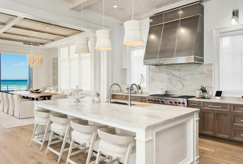
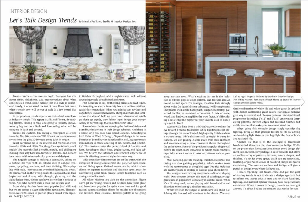
All white kitchens are also on the downslide. Please don’t get me wrong, whites and neutrals have their place and have been popular for quite some time…and for good reason. A neutral palette allows for broader use of textures and finishes. This universal, timeless palette is not going away anytime soon. What’s exciting for me is the inclusion of vibrant pops of color, pattern and textures into an overall neutral space. For example, if a client feels strongly about white (or light) kitchen cabinetry, I will complement this palette with a bold backsplash, unique countertop, patterned textiles or stand out accessories. A mix of stone, wood, and hardware amplifies the wow factor. It’s like adding a little cayenne pepper to your favorite dish to kick it up a notch. Bam!
Accent walls have been a tried and true way to draw the eye toward a room’s focal point while building in cost-savings through the use of limited, high-quality finishes where it matters most. While this can still be useful in some instances, we are guiding clients away from this approach and recommending a more consistent theme throughout the entire room. Some of the previously popular single wall moves are way more impactful as whole room concepts, especially when it comes to color or patterns such as paneling.
Wall paneling, picture molding, traditional crowns and casing are also gaining popularity, which makes sense with the reemergence of the gilded age! (pro tip: moldings are another place to explore kick up your sheen level!)
Our designers are moving away from traditional shiplap walls. Over the past decade, this type of paneling saw a gigantic rise in popularity, especially in coastal areas. While it’s still being used, we are playing with board widths and direction to freshen up a timeless treatment.
While we’re on the subject of walls, let’s talk about tile. Subway tile has and will continue to be classic. The standard combination of white tile and white grout is updated with darker contrasting grout colors. Horizontal patterns give way to vertical and chevron patterns. Non-traditional proportions including 2″x12″ and 4″x10″ create more interesting patterns. Beveled edges and textured finishes add subtle touches that make your treatment stand out.
When using this versatile design staple consider the lighting. Bring all that glorious texture to life by adding wall-washing light fixtures that highlight the face of brick and textured tile.
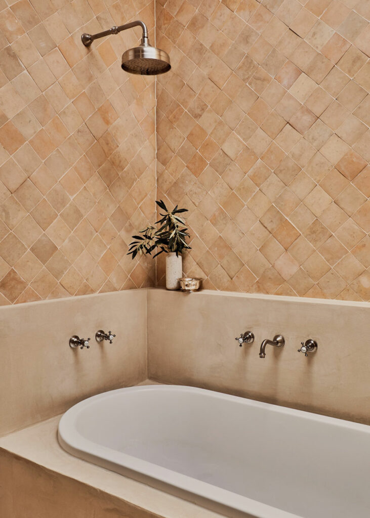
Another tile that is in the spotlight are traditional hand-crafted Moroccan tiles, also known as Zellige. While on the pricier side, they encapsulate almost every design element into one neat, tidy package. They are so versatile and offer an endless array of patterns, textures, colors, shapes, and finishes. It’s not for every space but if you are renovating, building or just want to look at beautiful things its worth considering. The uses are endless and Zellige will give a punch of design everywhere it shows up.
It bears repeating that trends come and go! The goal of sharing trends is not to dictate a design approach but to inform you about what is new and to share furniture, lighting, and material options you may have not previously considered. When it comes to design, there is no one right answer, it’s about finding the solution that works for you.
Photo Credits
Gilded Age
Marsha Faulkner Office photo credit: Jessie Preza
Wallpaper detail photo credit:
Quinn Harrington @hdco
Cottage Look
Studio M Interior Design
Japandi Style
Moretti Interior Design
Organic Finishes
Studio M Interior Design (Belfort Office) Photo Credit:
Jessie Preza
Zellige Tile
Moroccan Zellige 10x10cm Clay TilesOfEzra.com
Not White Kitchen
Fernandina Beach Home by Studio M Interior Design Photo: Jessie Preza
Destin Beach Home by Studio M Interior Design Photo: Dave Warren
Love design trends? Sign up for our newsletter or download our ebook
.


